
OUR PROCESS
Define Your Project Needs
Design
Implementation
Simple, Friendly, and Built to Build Trust
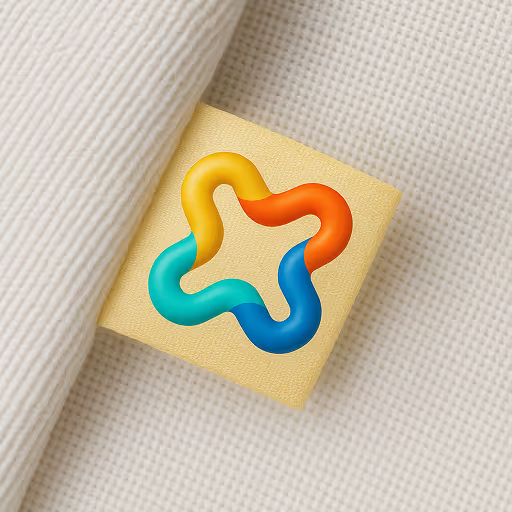
We redesigned the Freshquote logo to feel more open, modern, and trustworthy—without losing its approachable charm. The new symbol reflects clarity and care, using soft forms and balanced geometry to represent how Freshquote simplifies complex decisions. It’s bold enough to stand out across platforms, yet calm enough to feel personal in every interaction.

Confident Colors, Friendly Fonts
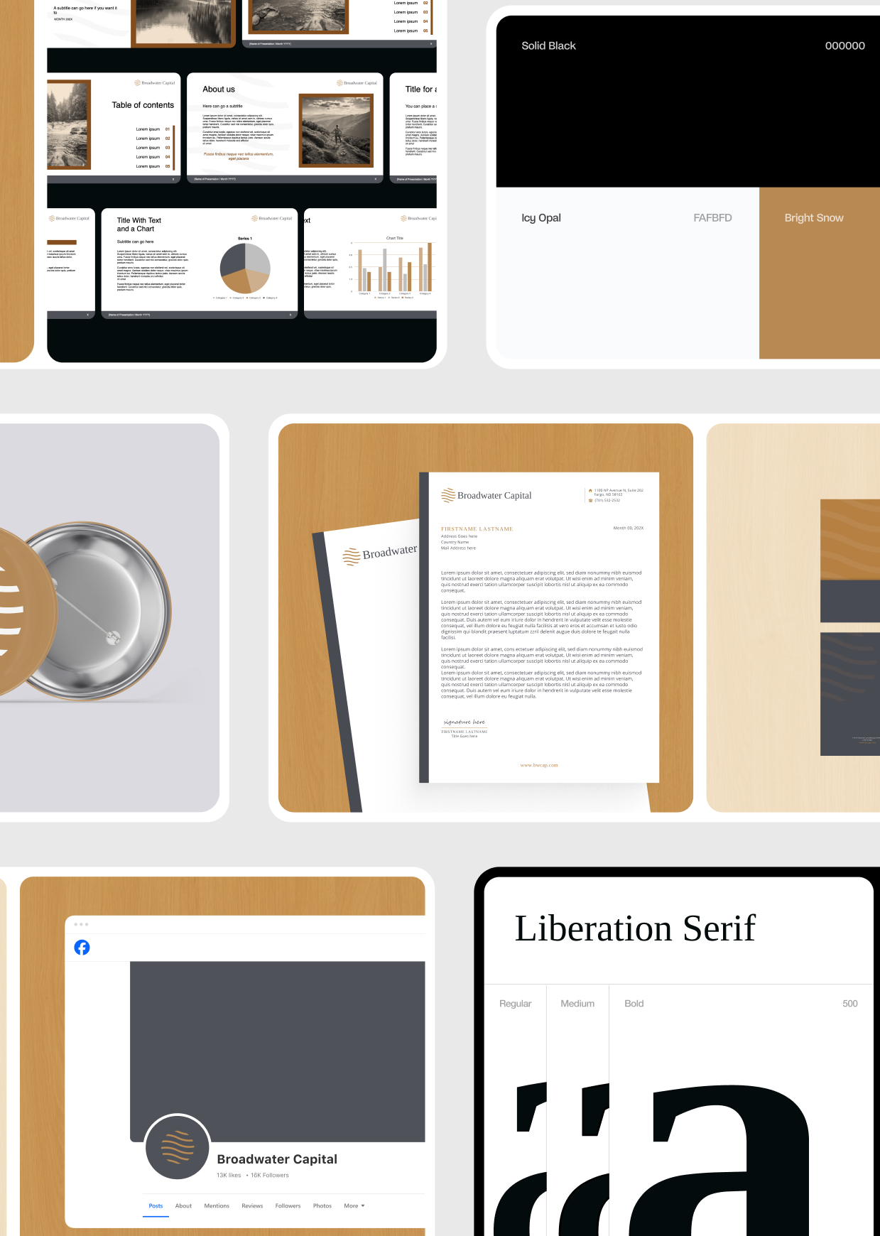
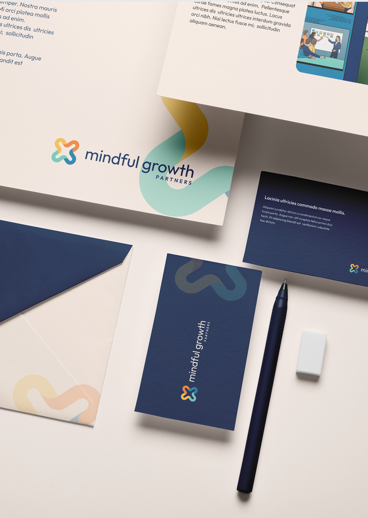
The Freshquote identity combines warmth and clarity—balancing professional trust with everyday approachability. We chose Poppins for its bold, modern feel and paired it with a softer serif for added character in supporting moments. The palette features bright greens, deep blues, and grounded neutrals, helping the brand feel vibrant and reassuring across every touchpoint—from dashboards to marketing.
.png)


Sally Nathans
.svg)