
OUR PROCESS
Define Your Project Needs
Design
Implementation
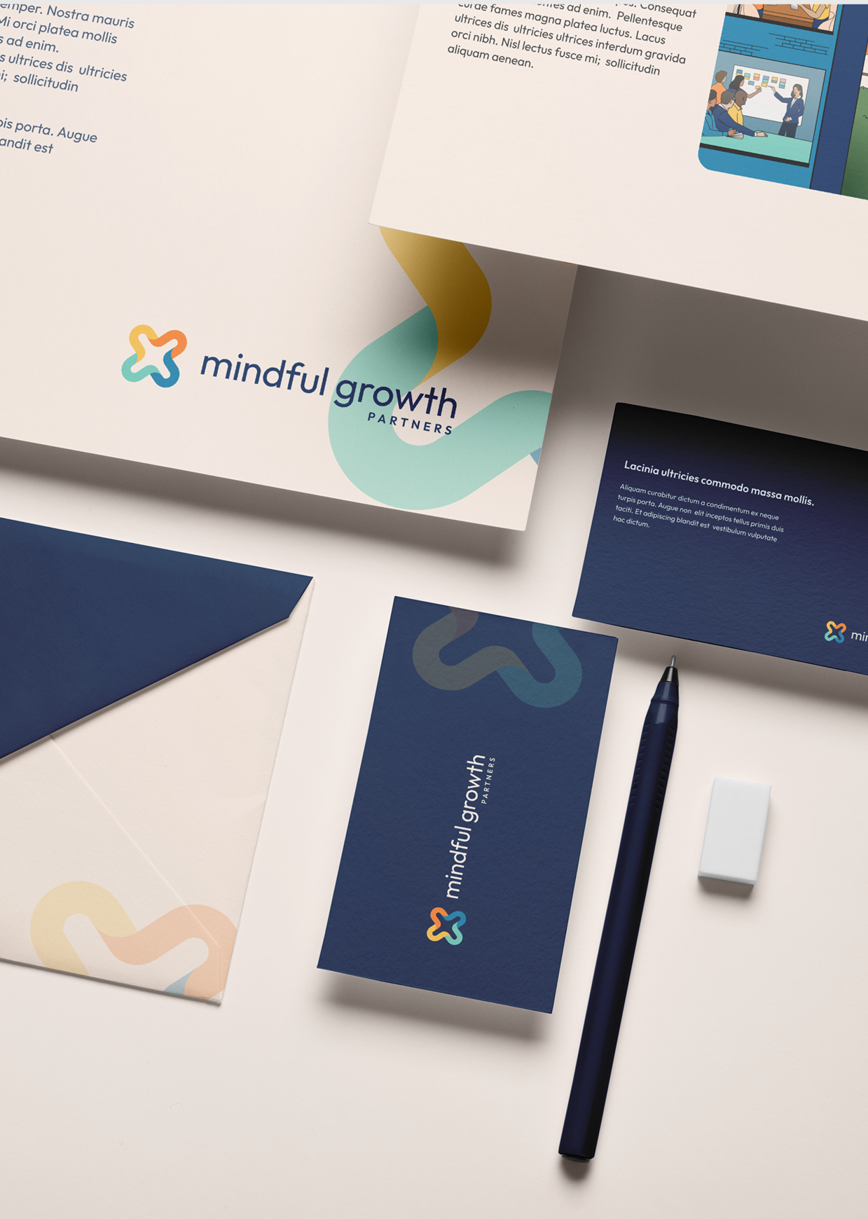
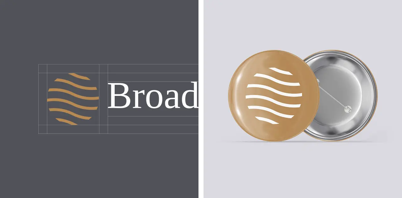
Rooted in Legacy. Refined for the Future.
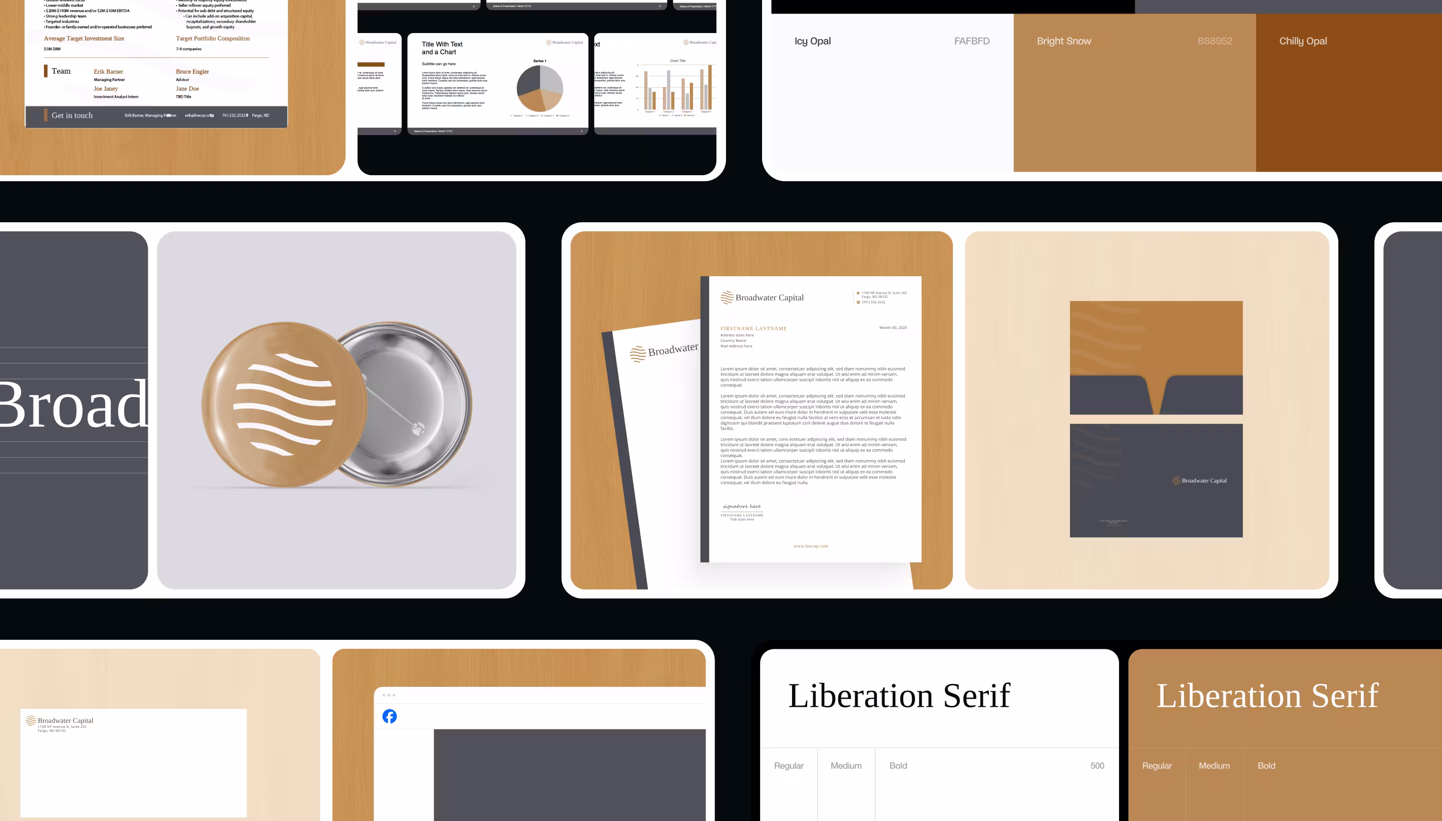
We designed Broadwater Capital’s logo to reflect the firm’s values—steadiness, trust, and long-term thinking. The mark takes inspiration from flowing waterways and regional landscapes, symbolizing clarity, momentum, and the strength of foundational businesses. Its refined geometry and warm tones strike a balance between tradition and forward motion—ideal for a firm built to partner with generational operators across the Midwest.
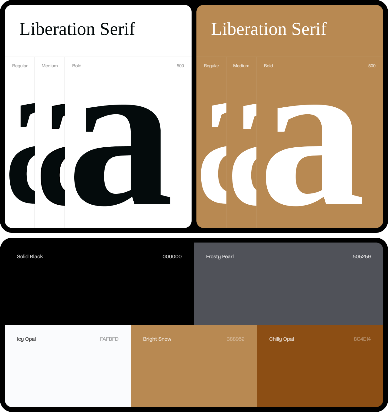
Rooted Elegance. Quiet Strength.
We selected Liberation Serif for its clarity, poise, and timelessness—qualities that reflect Broadwater Capital’s calm, steady approach to partnership. The color palette blends deep charcoals, warm metallics, and soft neutrals—echoing the natural tones of the American Midwest and the grounded values of the businesses the firm serves. Together, these elements create a brand that feels enduring, respectful, and confident without noise.
.webp)
.webp)
.webp)

Erik Barner