.png)

OUR PROCESS
Define Your Project Needs
Design
Implementation
Modernizing while Respecting legacy
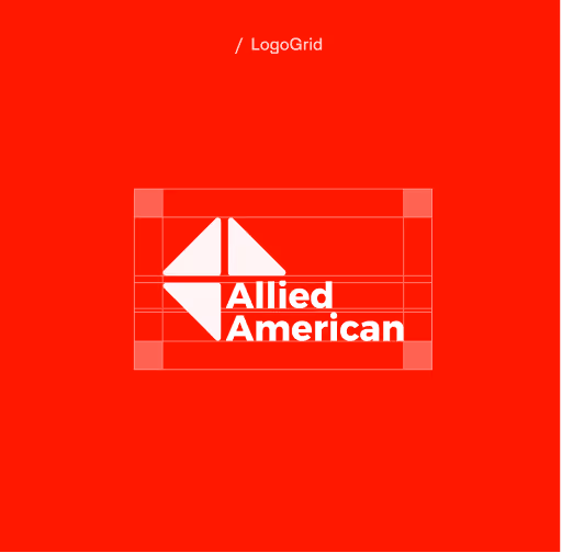
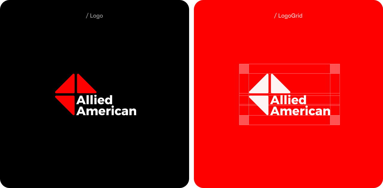
We refreshed Allied American’s tried-and-true “three-triangle” logo in a way that made it tighter, cleaner, and more modern. Most importantly, the new logo is more legible across all sizes big and small, in order to be recognized as a national brand across all types of media. As a final touch, we softened the angular corners of the triangles as a nod to the firm’s human touch.
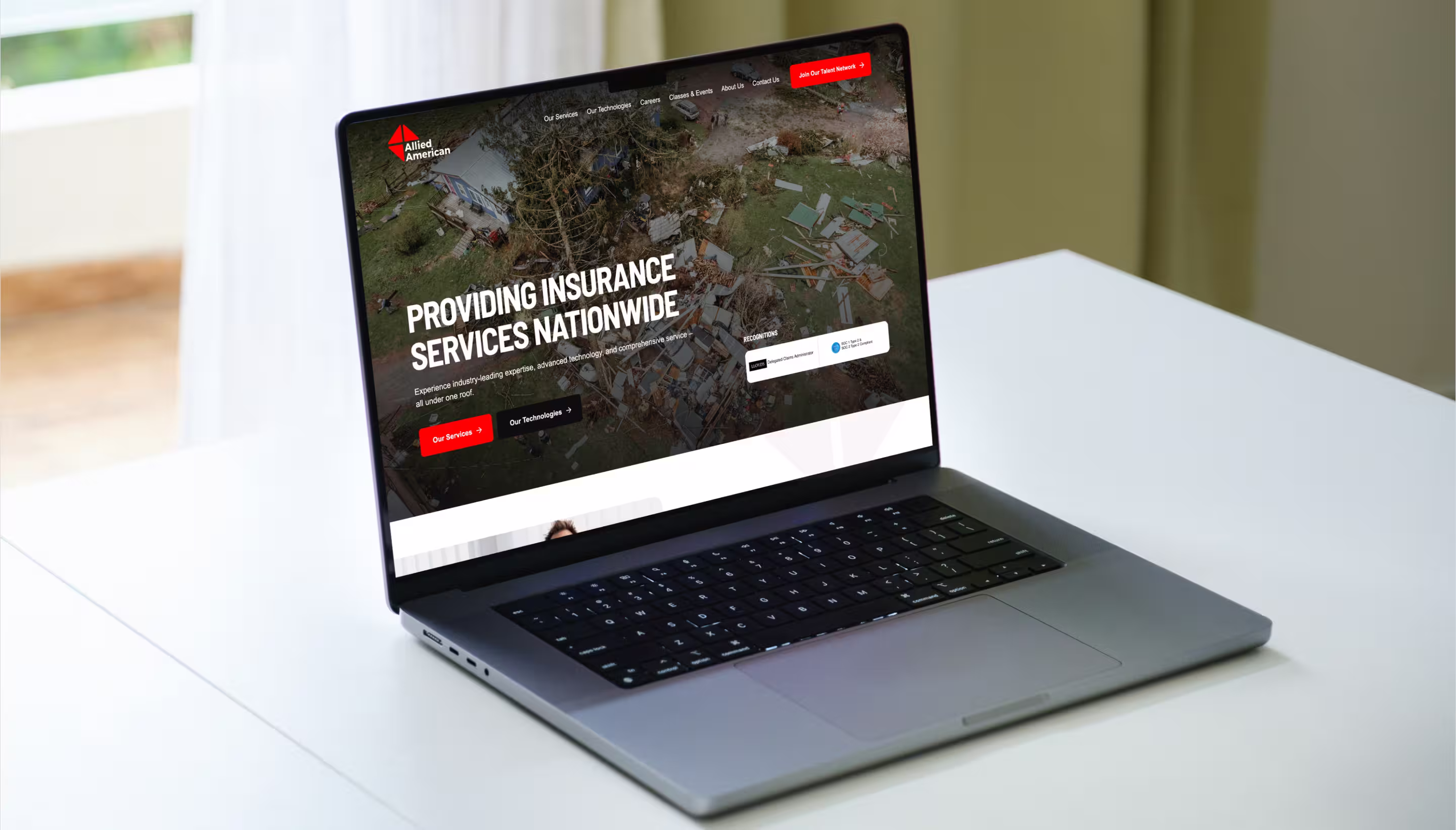
Modernizing the Brand With Bold, Strategic Design
To better reflect Allied American USA’s dynamic services, we revamped their visual identity with a fresh design system. Building on their black-and-red foundation, we introduced a bolder red, deeper neutrals, and an electric blue accent for enhanced visual hierarchy. The updated typography—Barlow Semi Condensed for headlines and Arial for body text—provides authority and clarity across all platforms. This refined palette and font system now create a more cohesive and modern brand experience.
.webp)
%20(1).webp)
.webp)


Joseph Jones
.png)