Her strategic insights and hands-on approach have helped these organizations navigate the ever-evolving and complex HR landscape and unlock their full potential.
OUR PROCESS
Define Your Project Needs
Design
Implementation
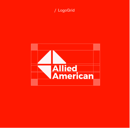
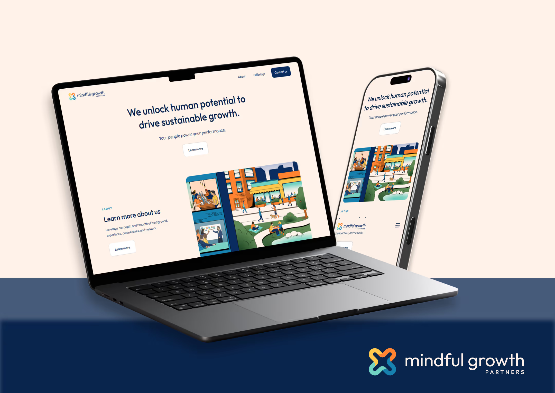
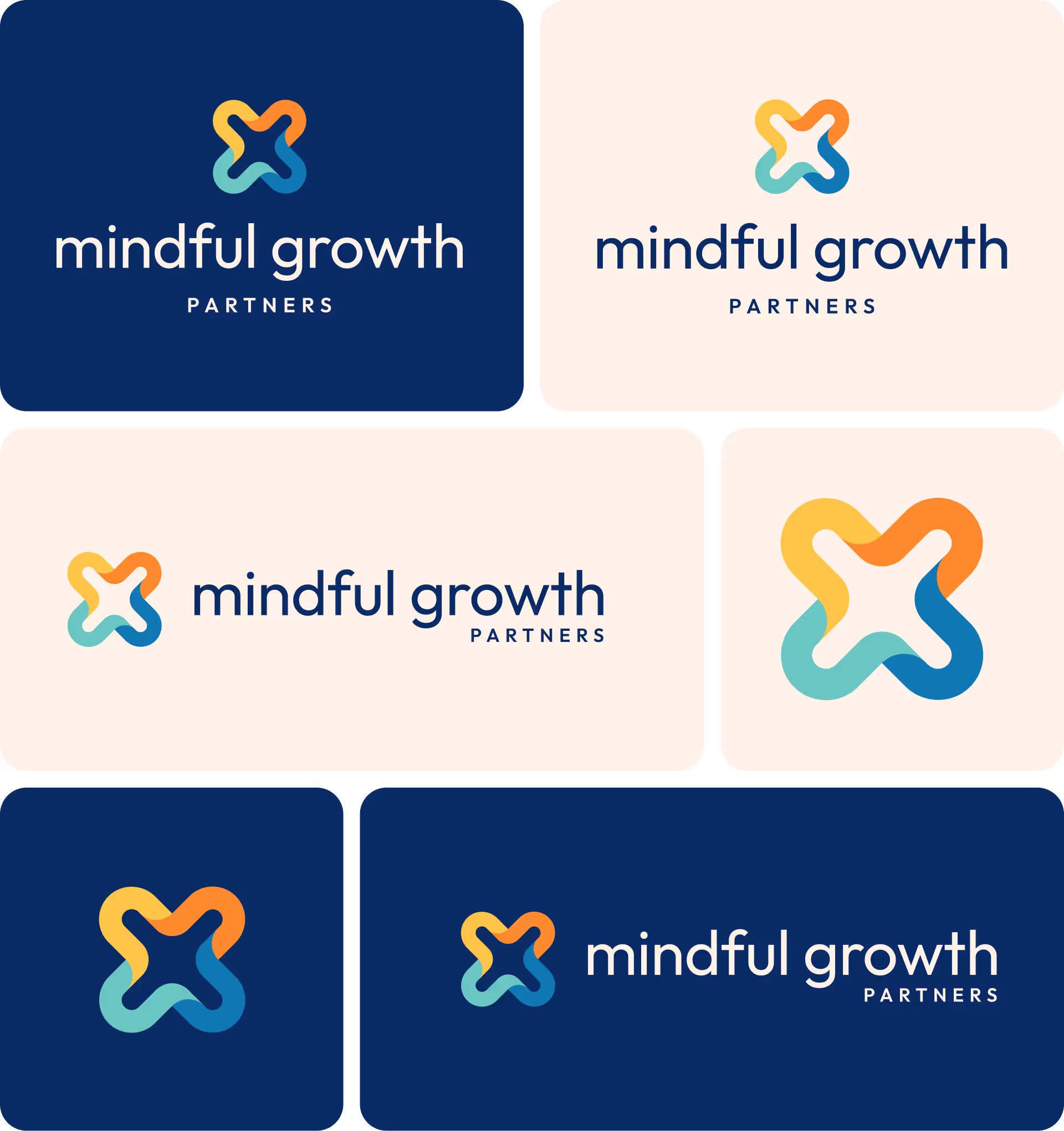
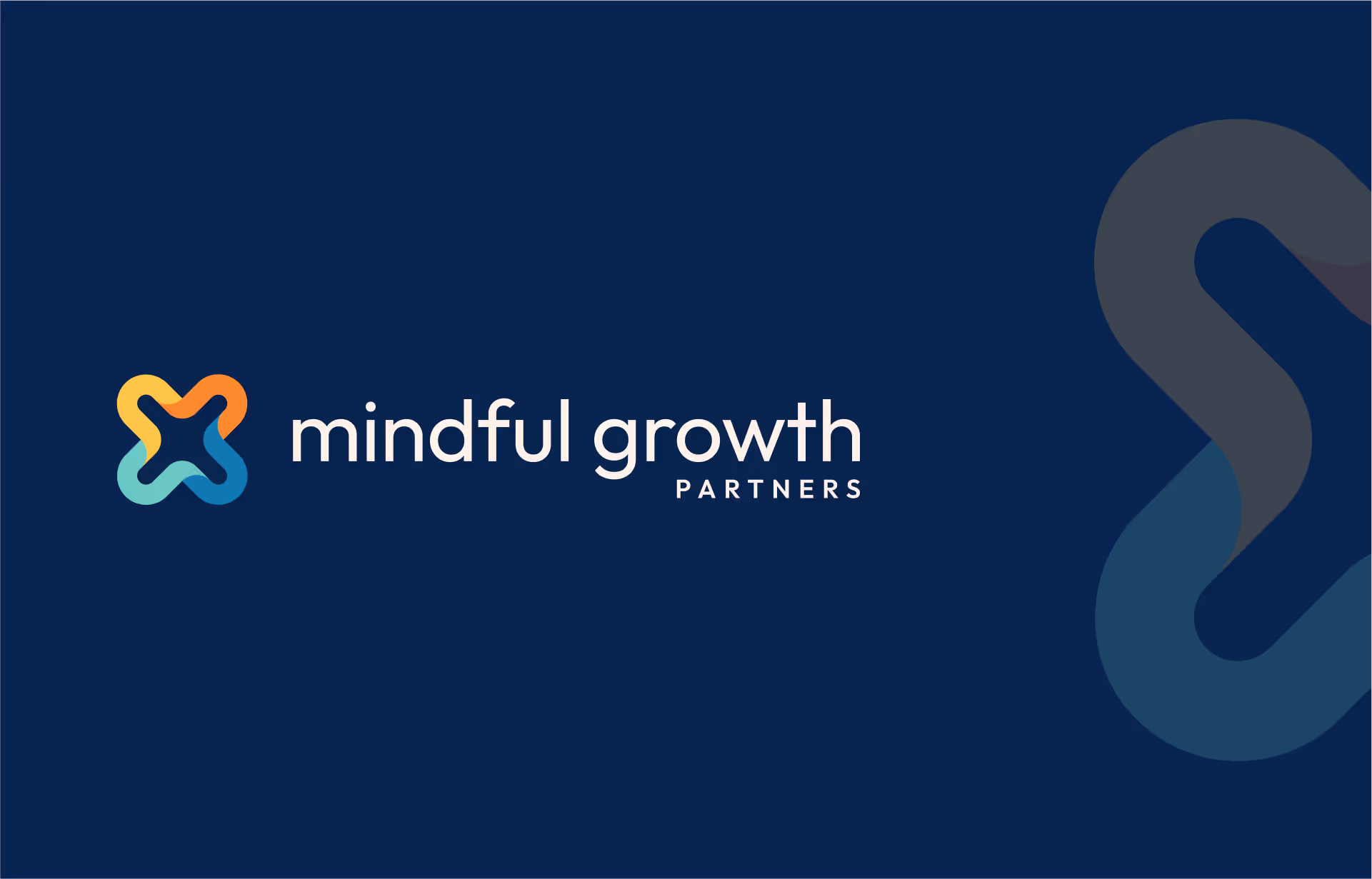
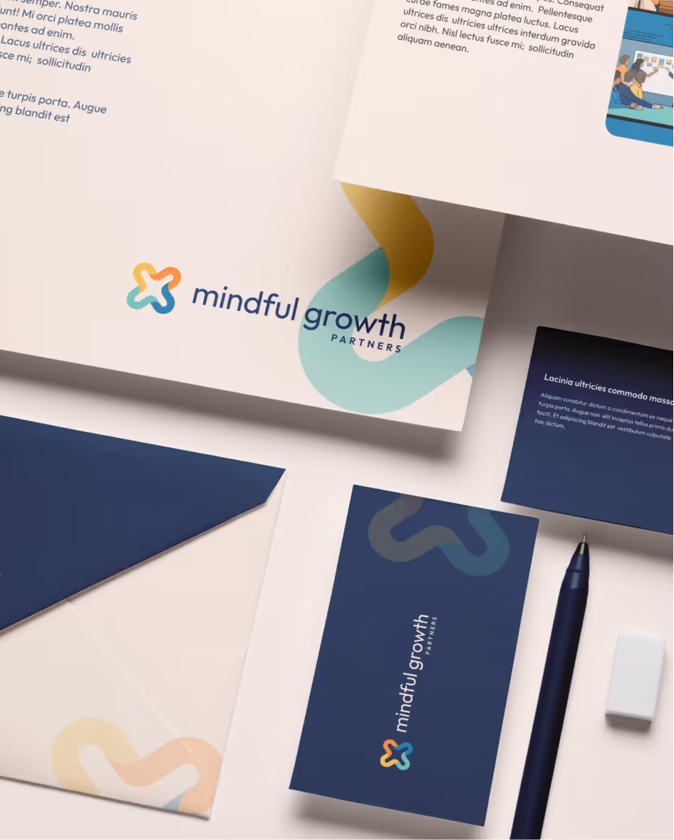
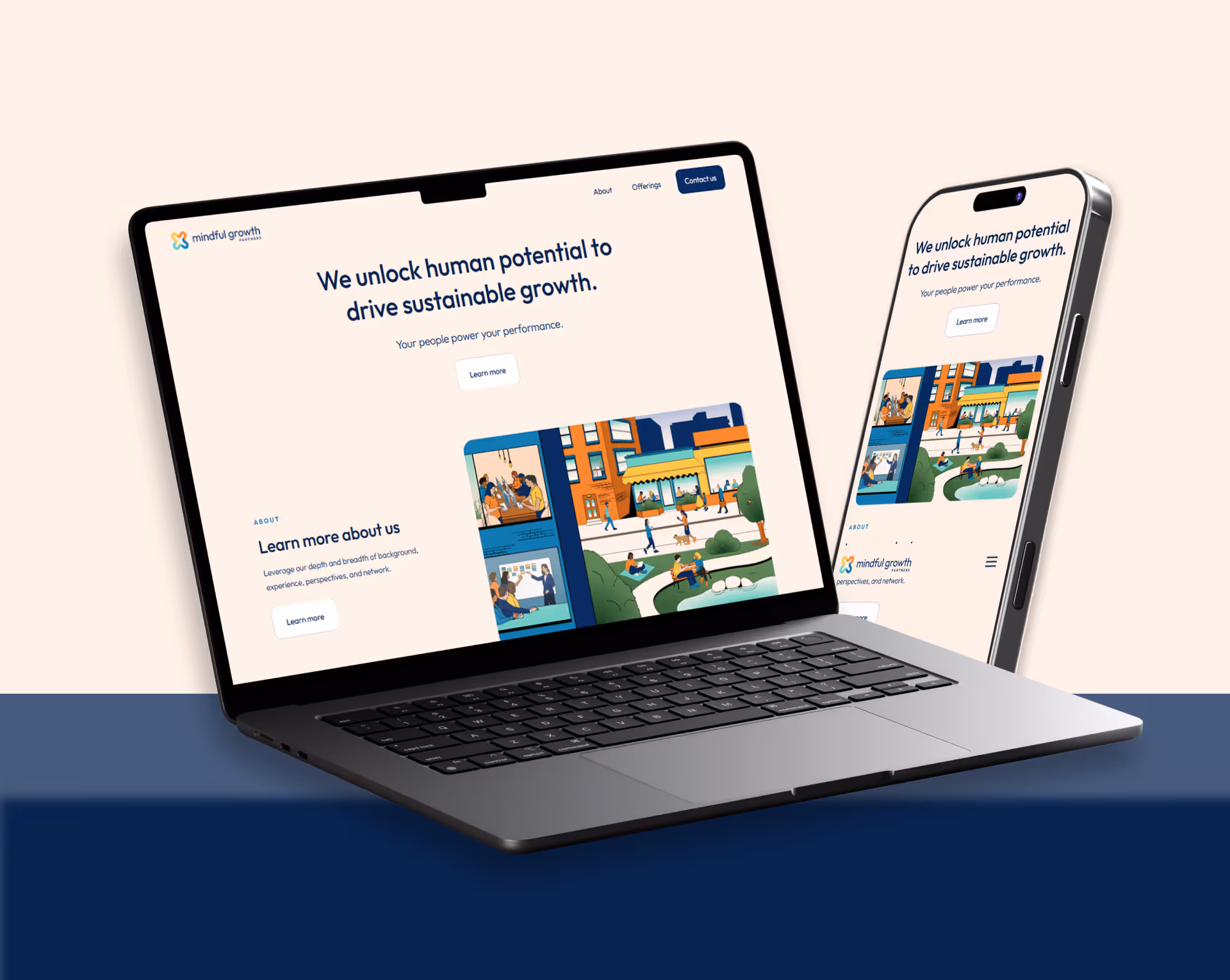
We refreshed Mindful Growth Partners tried-and-true “three-triangle” logo in a way that made it tighter, cleaner, and more modern. Most importantly, the new logo is more legible across all sizes big and small, in order to be recognized as a national brand across all types of media. As a final touch, we softened the angular corners of the triangles as a nod to the firm’s human touch.
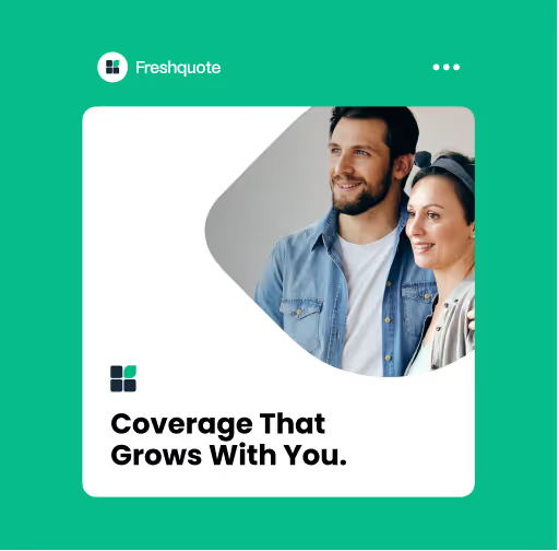
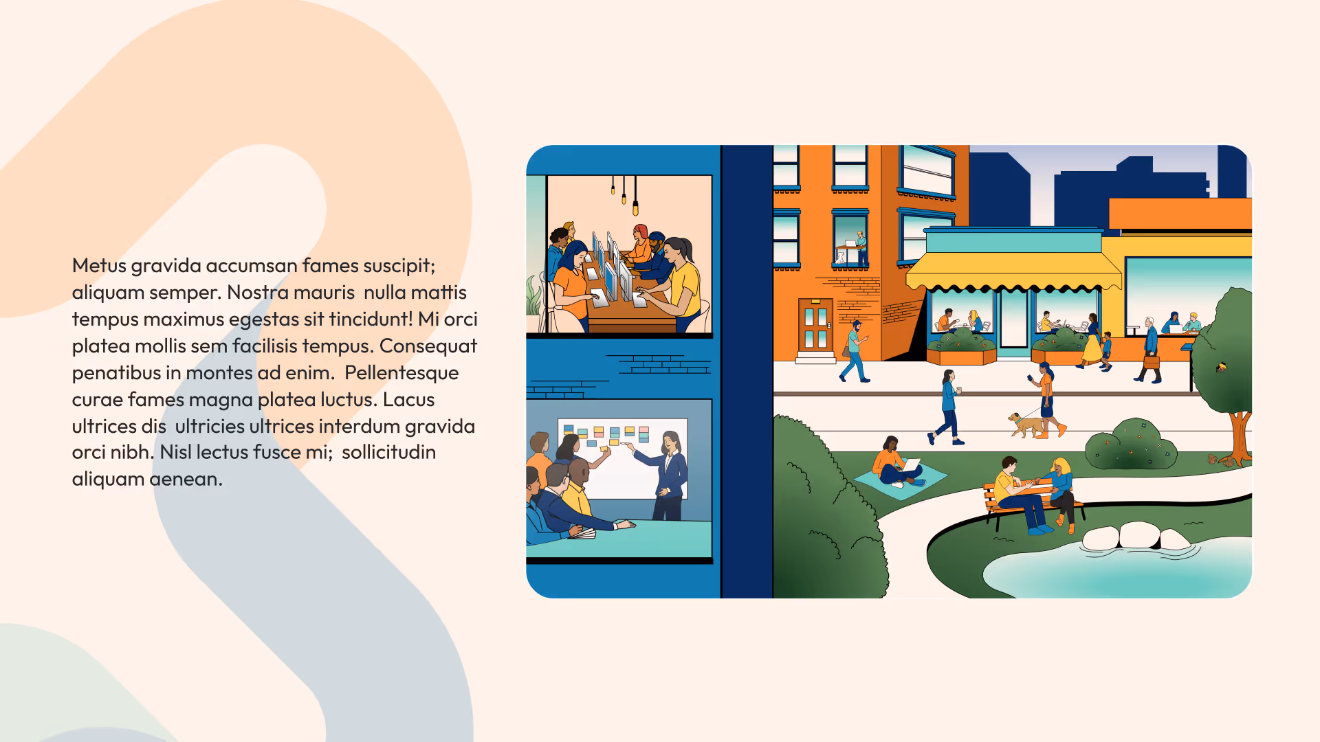
We took the company’s simple black and red color palette and expanded it with a bolder red, and more nuanced shades of black and white to create multi-layered design experiences. And for attention-grabbing secondary elements, we added a strong electric blue to the mix.
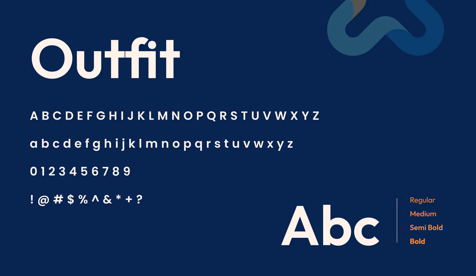
We hand-selected a bold set of sans serif typefaces for the brand, allowing for headers to stand out, and for body content to be easy-to-read on the web across devices, which is particularly important for a company working with insurance claims adjusters out in the field on a daily basis.

Chera Howard
-1.png)